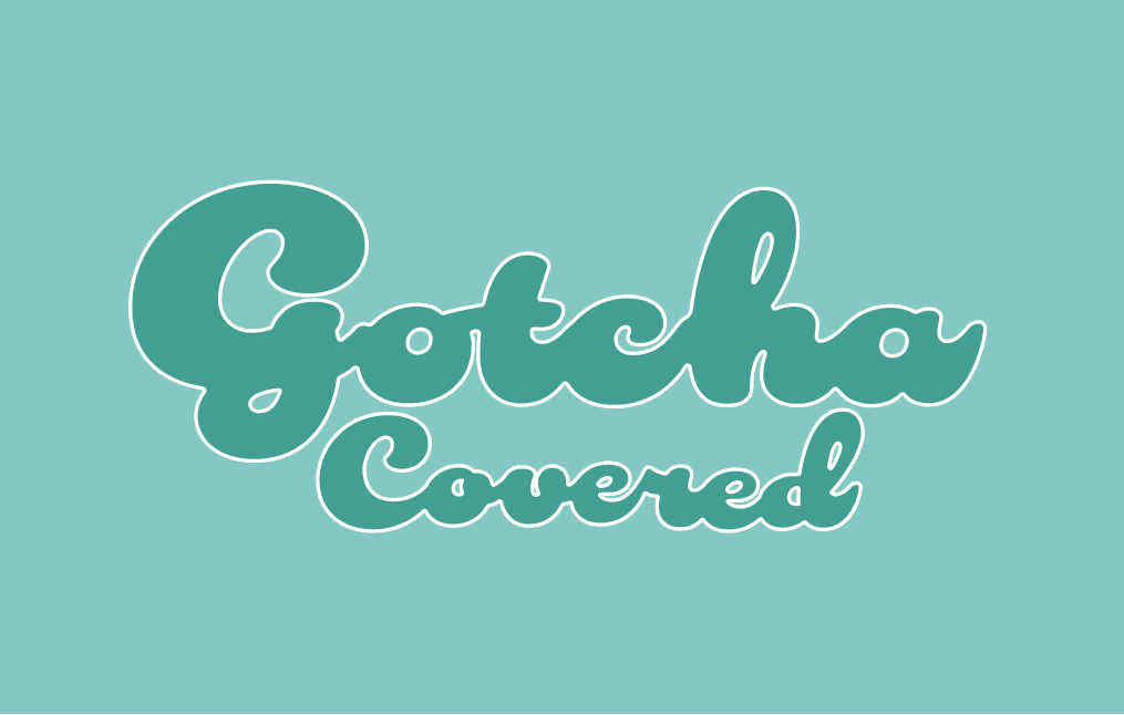
GOTCHA COVERED
Gotcha Covered is a hypothetical eco-friendly sanitary product brand that I built from the ground up during this project.
This project involved creating a brand identity for Gotcha Covered and packaging design.
The name Gotcha Covered was selected because it brings the element of casualty when conversing about menstruation, which is something many women go through and should be normalised. The term gotcha covered means that the brand is here to help with high quality sanitary products for your menstruation needs.
Traditional sanitary pad packaging involves multiple layers of raw un-recyclable LDPE plastic and silicone release paper made unethically. This contributes to pollution and “An average of 500 million sanitary products ending up in landfill every month” (The Period Lady. 2023).
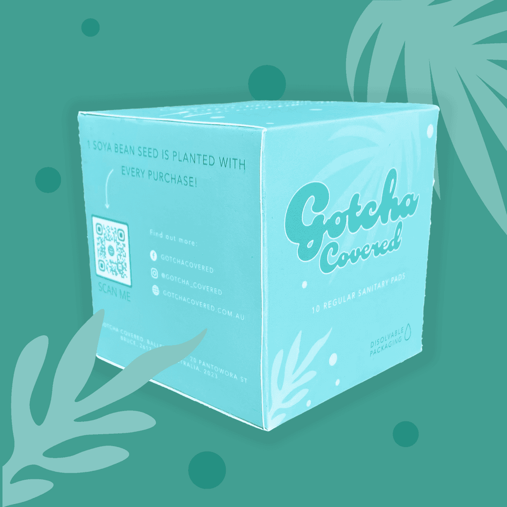
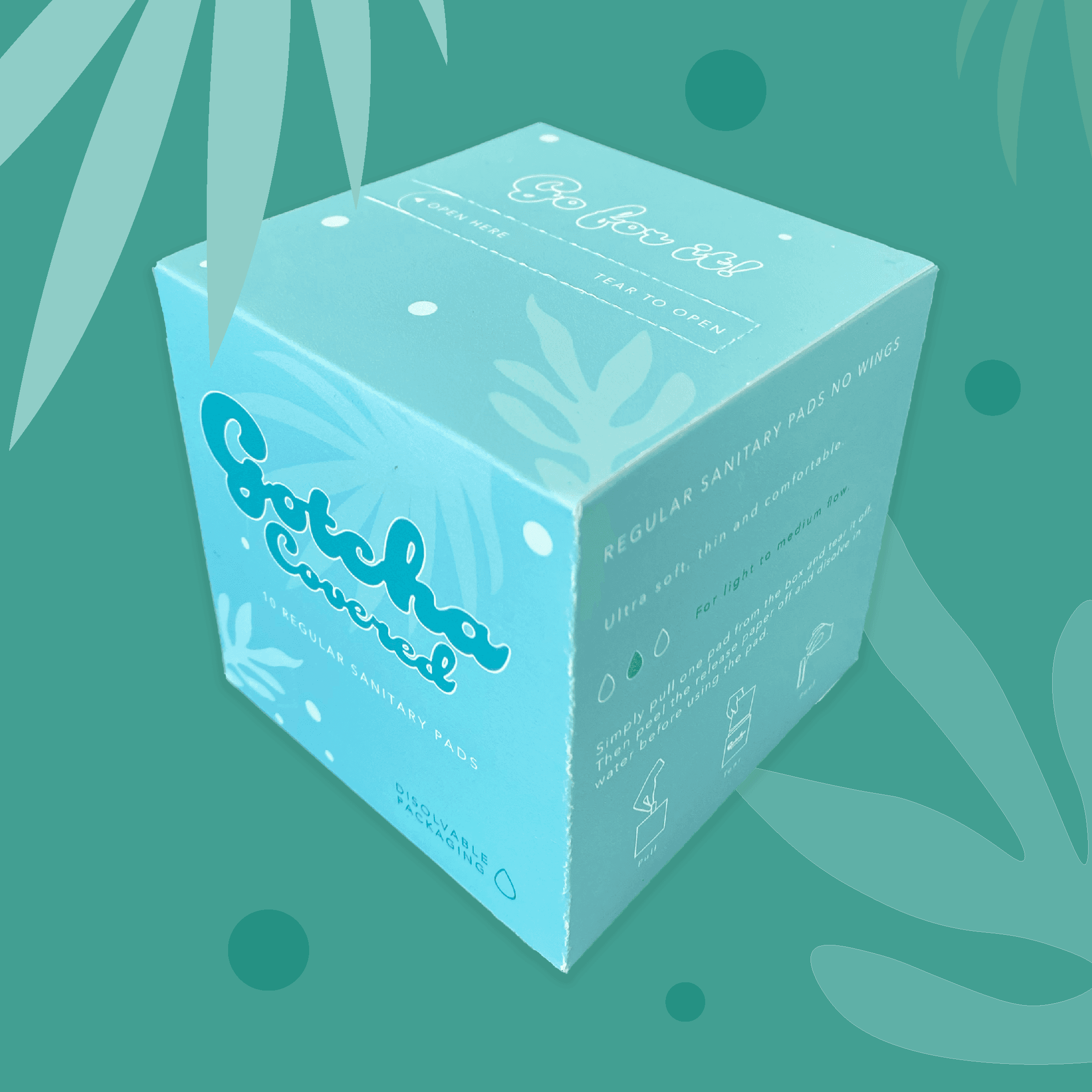
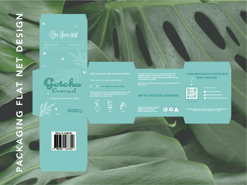
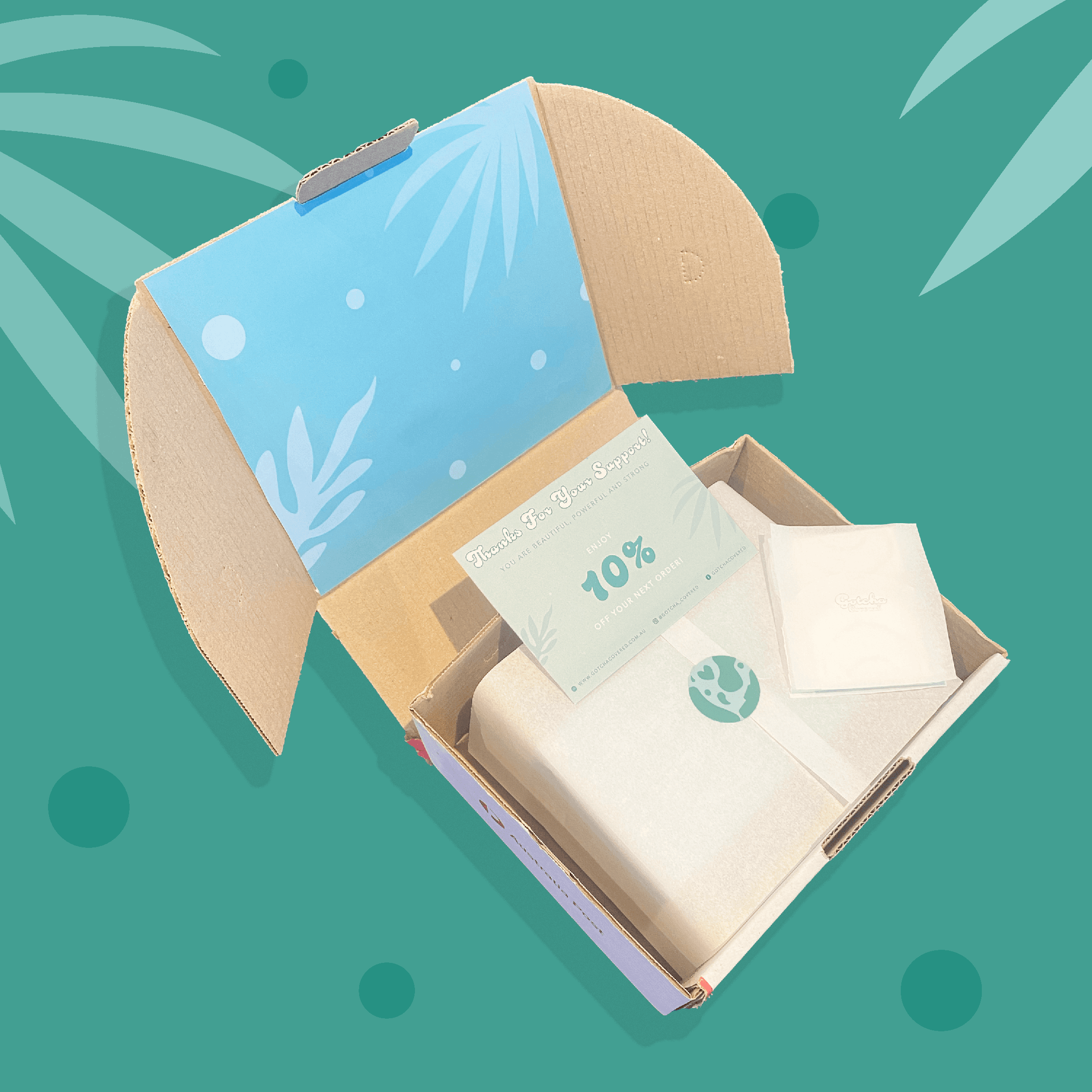
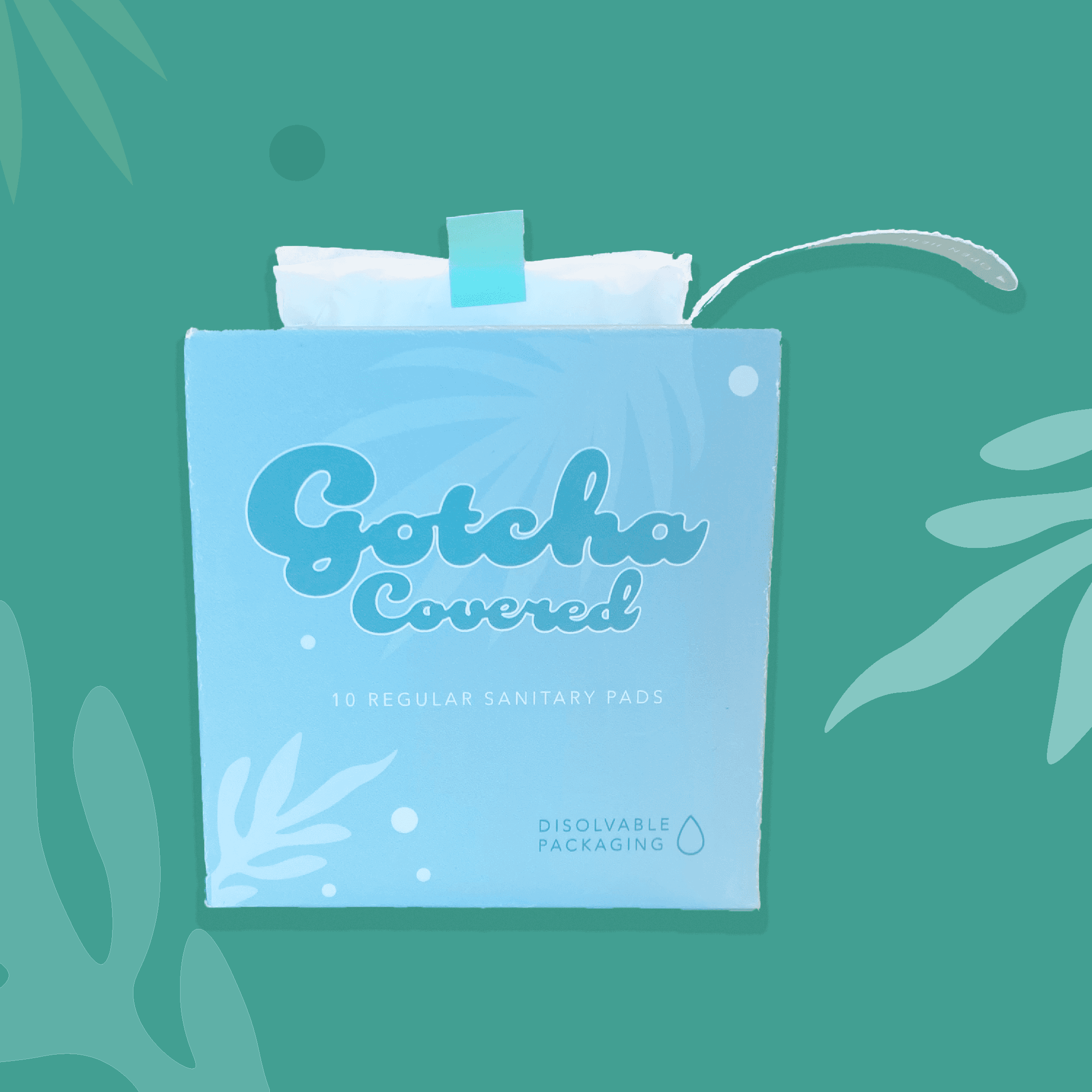
As a woman myself, I take great pride in this project not only for its design features, but also it's impact. Gotcha Covered is about normalising and celebrating menstruation as well as giving back to the environment. This sanitary pad packaging is made out of 100% sustainably sourced and non processed paper externally which is dyed with natural soya inks, the internal pad liners are made from a non stick soya bean oil coated easy-remove paper film which are pulled from the box in an accordion. This means that there is 0 plastic waste involved in this packaging, and is 100% recyclable, beside from the pads themselves which must be discarded in general waste bins. For every purchase, a soya bean seed will be planted to be used in future packaging. The aim of this concept is to close the lifecycle loop and be a cradle-cradle design while offering unique visual branding to grab attention and differentiate from competitors.
This packaging design is 10xm x 10cm in size and features an easy tear opening to pull the accordion of sanitary pads. The colours are green which resemble the companies devotion to the environment. There are information, signs and symbols arranged throughout to indicate the purpose of the brand and how to use the product. The contact information and a QR code on the back allow the user to view the impact they their sustainable purchase decision has on the environment and see a the soya bean seed they planted with their purchase.
Traditional sanitary pad packaging involves multiple layers of raw un-recyclable LDPE plastic and silicone release paper made unethically. This contributes to pollution and “An average of 500 million sanitary products ending up in landfill every month” (The Period Lady. 2023).
As a woman myself, I take great pride in this project not only for its design features, but also it's impact. Gotcha Covered is about normalising and celebrating menstruation as well as giving back to the environment. This sanitary pad packaging is made out of 100% sustainably sourced and non processed paper externally which is dyed with natural soya inks, the internal pad liners are made from a non stick soya bean oil coated easy-remove paper film which are pulled from the box in an accordion. This means that there is 0 plastic waste involved in this packaging, and is 100% recyclable, beside from the pads themselves which must be discarded in general waste bins. For every purchase, a soya bean seed will be planted to be used in future packaging. The aim of this concept is to close the lifecycle loop and be a cradle-cradle design while offering unique visual branding to grab attention and differentiate from competitors.
This packaging design is 10xm x 10cm in size and features an easy tear opening to pull the accordion of sanitary pads. The colours are green which resemble the companies devotion to the environment. There are information, signs and symbols arranged throughout to indicate the purpose of the brand and how to use the product. The contact information and a QR code on the back allow the user to view the impact they their sustainable purchase decision has on the environment and see a the soya bean seed they planted with their purchase.
Get to know me better…


Get to know me better…