KANBI
Kanbi is hypothetically located in Canberra and builds in various areas throughout the ACT with financial support from the ACT Government, so that homes can be provided at lower costs for those who have lost everything in the bushfires.
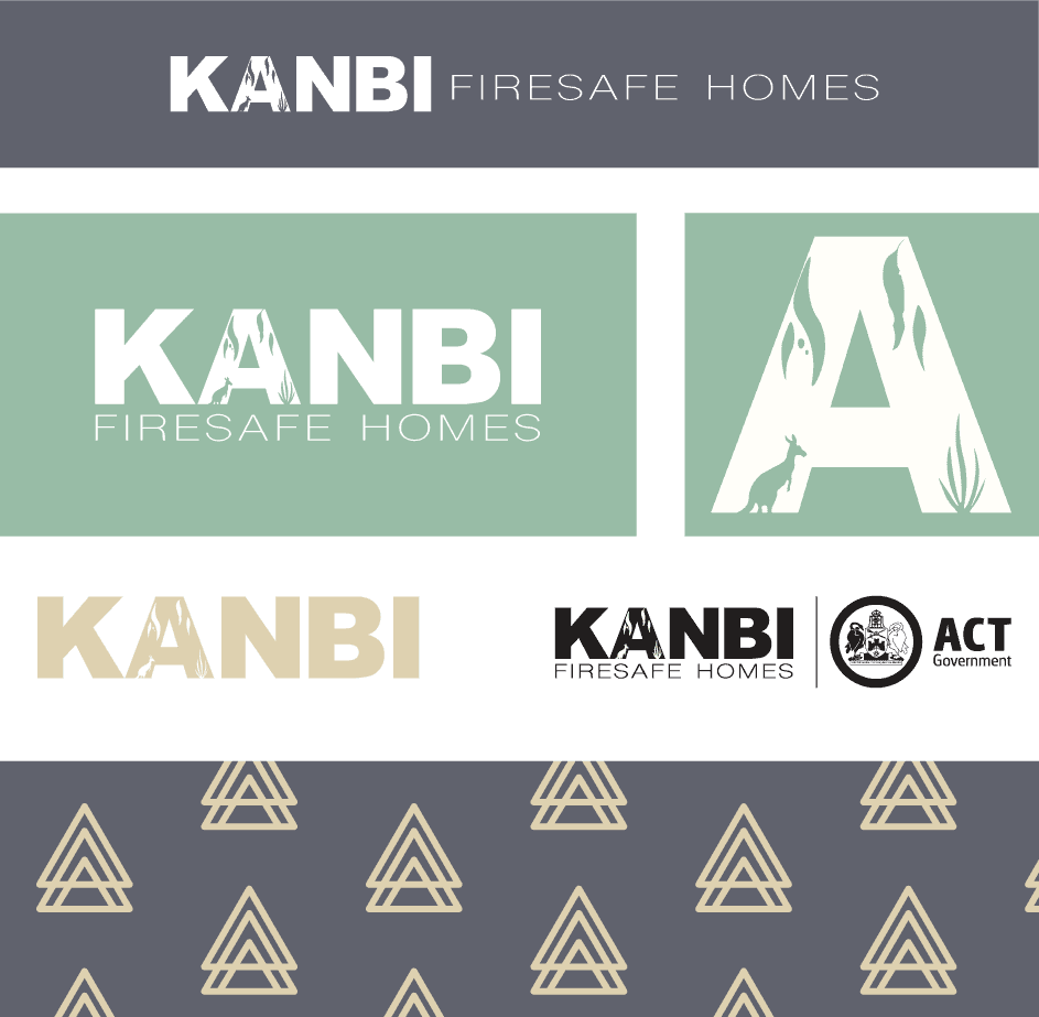
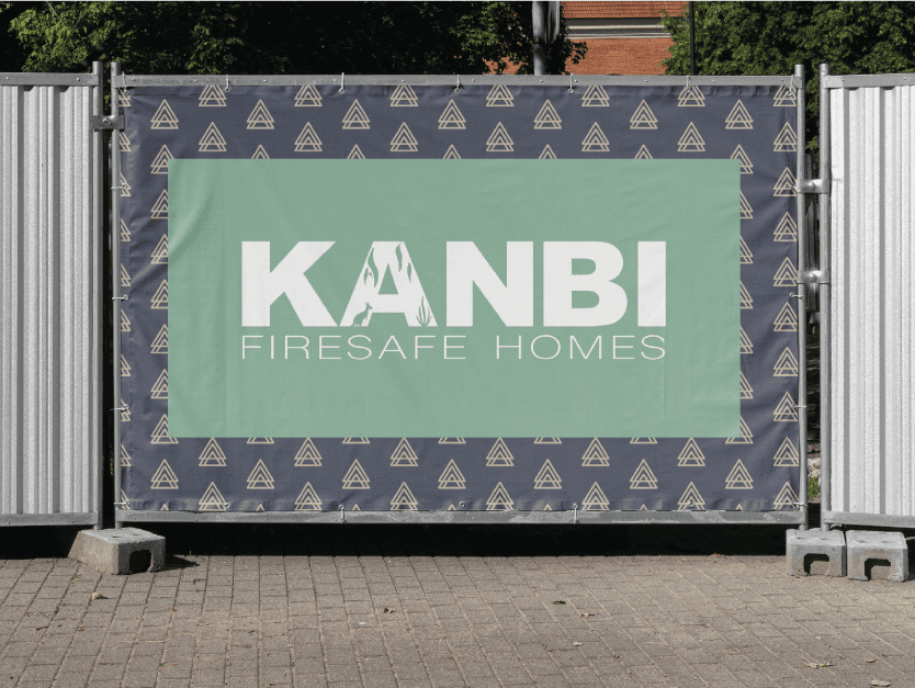
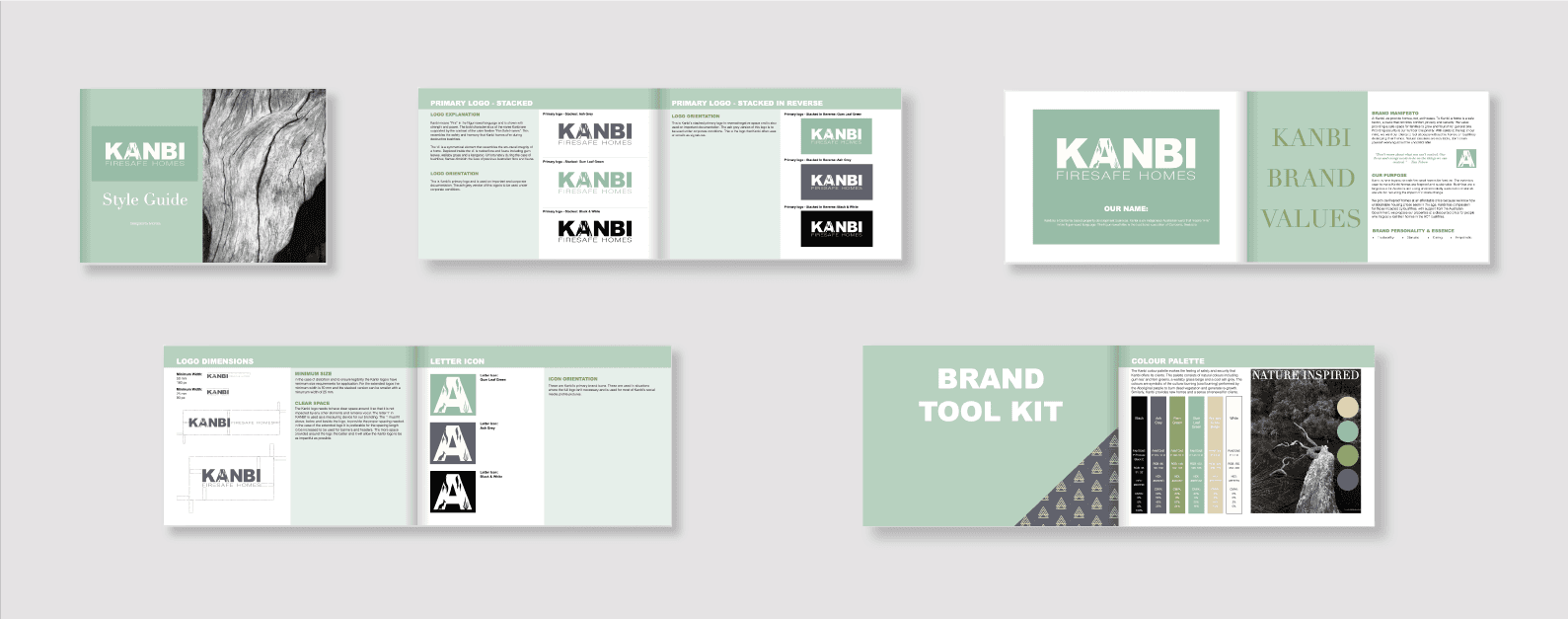
The logo is bold and resembles similar typographic features to the Australian Fire & Rescue and the Rural Fire Service NSW logos. Inside the 'A' of the logo is gum leaves, native grass and a Kangaroo, connecting the brand to the Australian bush capital Territory. The primary colour gum leaf green, and secondar colours, beige, ash grey and black, represent the circular phases of bushfires. This process includes beige dry grass, ash coals, black burn damage, & green regrowth. In addition, Kanbi's pattern icon portrays a triangular shape that resembles Indigenous Australian teepees.
KANBI
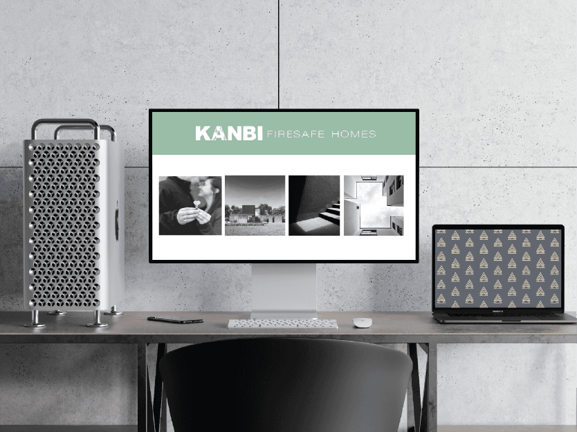
This project involved developing a brand identity and style guide for a property development group. During this project I developed KANBI from the ground up. The idea behind Kanbi is to provide affordable fireproof homes and safety to those affected by the ACT bushfires. Kanbi means “Fire” in the Indigenous Australian Ngunnawal language, the tribe of the Australian Capital Territory.
Kanbi is hypothetically located in Canberra and builds in various areas throughout the ACT with financial support from the ACT Government, so that homes can be provided at lower costs for those who have lost everything in the bushfires.
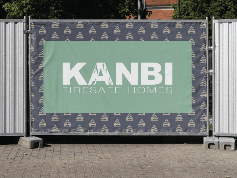
The logo is bold and resembles similar typographic features to the Australian Fire & Rescue and the Rural Fire Service NSW logos. Inside the 'A' of the logo is gum leaves, native grass and a Kangaroo, connecting the brand to the Australian bush capital Territory. The primary colour gum leaf green, and secondar colours, beige, ash grey and black, represent the circular phases of bushfires. This process includes beige dry grass, ash coals, black burn damage, & green regrowth. In addition, Kanbi's pattern icon portrays a triangular shape that resembles Indigenous Australian teepees.
Get to know me better…


This project involved developing a brand identity and style guide for a property development group. During this project I developed KANBI from the ground up. The idea behind Kanbi is to provide affordable fireproof homes and safety to those affected by the ACT bushfires. Kanbi means “Fire” in the Indigenous Australian Ngunnawal language, the tribe of the Australian Capital Territory.
Get to know me better…